Napa
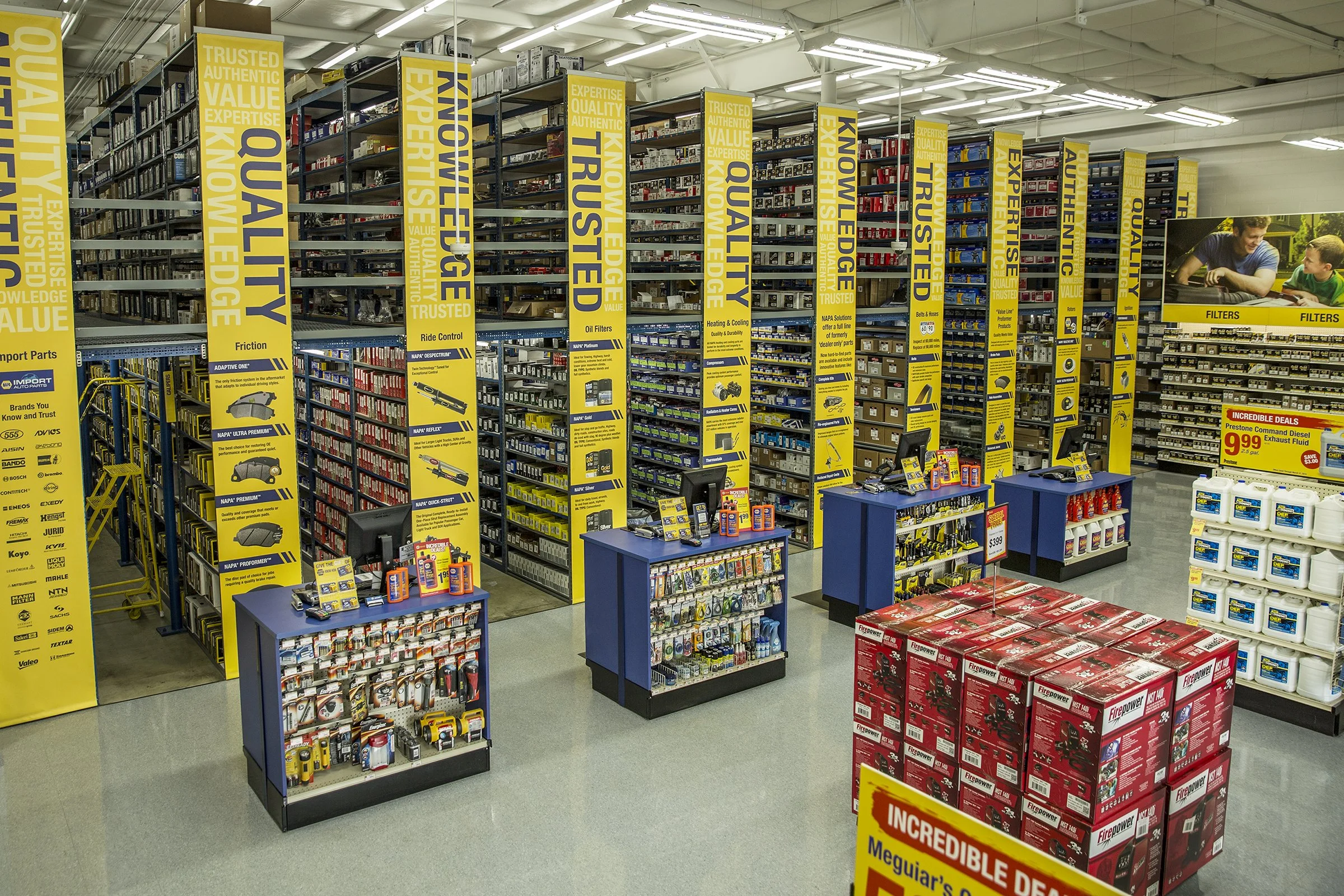
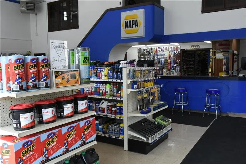
Expanding a 100 year old retailer’s customer base is a challenge, even more so when it sells auto parts. Enticing women and novice men to take on even simple basics of home car care meant throwing out a time tested store layout.
In-depth customer studies revealed a willingness to DIY some simpler basics, but extreme trepidation in shopping a store so far out of their comfort zone. Removing the wall between storage and sales floor created the feeling of “store” instead of “repair shop”, and clearly showed that more products were available than what was on display shelves, encouraging interaction with staff beyond checkout. Revising checkout and display elements to evoke more typical retail stores offered newbies familiarity around unfamiliar products. And bold signage conveying brand values first, product second spoke more clearly to those with no knowledge of auto parts, but instead bought based on brand perception.
Within the first six months of a 30 store test, sales increased over 15%, and traffic from new targeted demographic groups grew 11%.
Old store model (right) based on auto industry service model
Kroger
New self check-out areas were expected to reduce queueing in stores. Instead lines worsened.
A queuing study, originally intended to assess budget needed for additional tech solutions, instead revealed that adding one additional staff at each checkout section to handle coupons, I.D. checks and scan failures would resolve the queue problem far more effectively — and affordably — with no additional tech. In addition, test pilots revealed a 29% drop in scan theft with the extra set of eyeballs, and a customer satisfaction score lift of up to 40%.

Orchard Supply
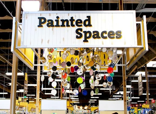
Tasked to deliver a strategy to revitalize store sales, a deep dive into the customer and their shopping journey revealed a unique challenge. While traditional suburban locations were well served by existing store layouts, more than half the stores were located in dense urban areas. These consumers lived mainly in apartments, lacked tools or storage space and most had zero DIY skills. They lacked the confidence to shop in a DIY store, and no need for big projects.
A strategy to rethink store layouts, without major redesign, was the answer. By grouping products into tighter, task specific sections with bolder signage and strong visuals, shoppers were clearly guided to the right department.
By combining staffed work stations with services tailored to apartment dwellers — such as screen repairs, wood cutting and keys, urban customers could more confidently use the store, resulting in a 12% increase in sales the first week after reopening, and a 27% increase in sales in the first three months of roll-out.
Some key tactics included use of engagement tech to mirror a typical film plot structure to immerse shoppers in the store and engage with the products, just as they did in the experience.

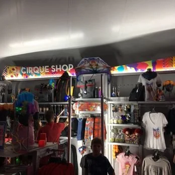
Cirque du Soleil
While Cirque’s iconic shows drew devoted fans and global acclaim, retail sales missed the mark.
A deep dive into the customer journey revealed a stark disconnect between the magic sparked during performances, and the jarring let-down of a bland retail experience.
A new strategy infused Cirque magic into the retail experience, which unlocked soaring engagement and sales, and has become the baseline for all Cirque retail since.
New format (left): Immediate 30% sales lift + 64% increase in high value product sales
Old format (below): Weak sales, chiefly on lower priced items
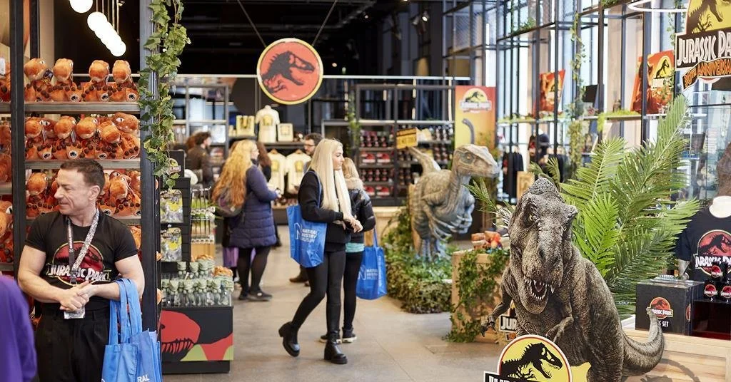
Jurassic World Experience Retail Store
Who doesn’t love playing with dinosaurs? Working with Universal Studios for the Jurassic World Exhibition I tracked the customer journey from ticket download, through exhibit to retail space to see why store sales had slumped. My findings: after interacting with life sized dinosaurs, how do you refocus event goers on shopping? A step-down transitional strategy did the trick, lifting sales over 23% in the first week.

